

In mid-2018, Before my move to Canada, I was approached by my former CTO from BonAppetour, to help set up the design team of Y Combinator startup Aspire. There, I executed an end-to-end redesign of the entire funding platform, set up automated usability testing, and built the foundations of the design system.
Role
Product Designer
TIMELINE
3 months
Background
In Southeast Asia, the digital economy is expected to grow six-fold to over $200 billion a year, yet over 50% of small-medium businesses don’t have access to credit. Aspire aims to bridge this gap by using automated risk technology to offer same-day loans to business owners.
Problem
Small businesses owners turn to Aspire over traditional banks because they are looking for accessible working capital, meaning short processing times, a smooth online application, and transparent, flexible repayments.
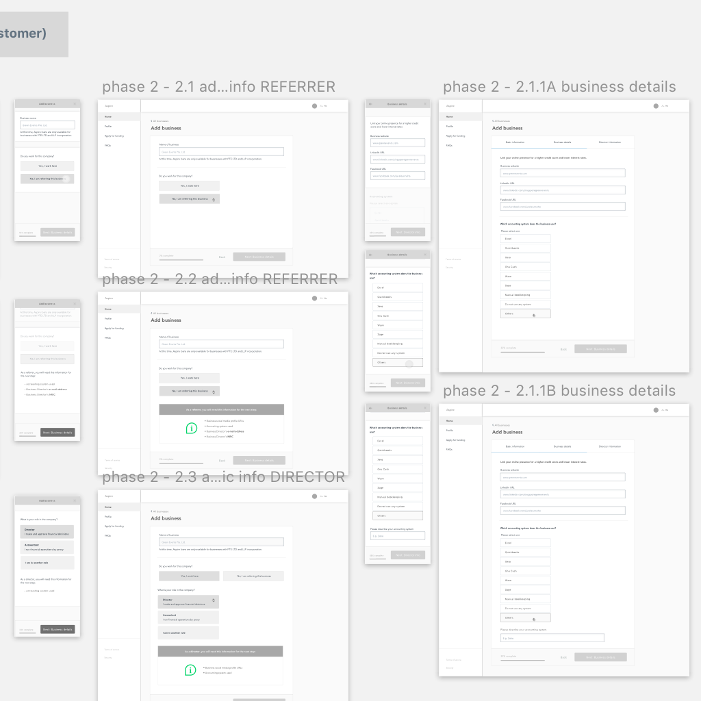
As Aspire grew, we discovered that a significant percentage of our target end users relied on brokers to facilitate. To capture that market segment, we had to figure out how to incorporate the distinct user journey of brokers onto the platform.
Additionally, the redesign needed to address the host of usability issues that surfaced as the first batch of users completed the customer cycle on the MVP, which was already generating revenue.
In sum, we asked the question: How might we redesign funding to become business-centric instead of user role-centric, in a way such that applications and repayments are easy and understandable?
Framing
The problem encompassed two distinct parts of the customer funnel - the application and post-application phase. I ran a 1-day knowledge sprint each, working closely with a PM and involving stakeholders from different teams to understand and frame the problem, coming up with the following:
Requirements
Create an optimize a new user journey that serves the needs and desires of two distinct user groups
Improve usability to decrease average time to complete an application and cut support hours per application
Increase perceived findability of information on the repayment process to improve full repayment success rates
Constraints
Constant fine-tuning of the internal risk engine meant that risk-specific components needed to be easily switched out, modified and rearranged
Future market expansion plans meant that country-specific components of the system needed to be modularized
Security, usability needs and technical requirements had to be balanced, especially when integrating with third-party platforms
The Framework
ANALYZING THE USER JOURNEY
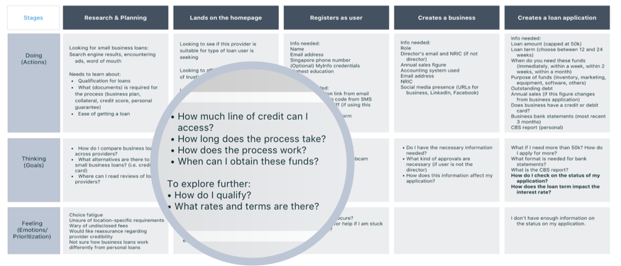
This experience map became the scaffold of the redesign and sheds light at every stage on what were the goals of users, how they accomplished them, and where they struggled.
To do this, I began gathering information by interviewing customers at all stages of product usage. I then interviewed members of our customer success, partnerships and risk teams. Analysis of user conversations on Intercom and user actions on FullStory filled in the gaps, allowing me to come up with a user journey.
CARD-SORTING
To manage consistency, I ran a modified card-sorting session to pin down a common language. This was important because as the company grew, the terminology used in copy and conversations across teams quickly began to splinter. We eventually kept track of these terms on Google Sheets.
Ideation Process
User journey / I fleshed out the user journey by blocking out rough interactions for each action point.
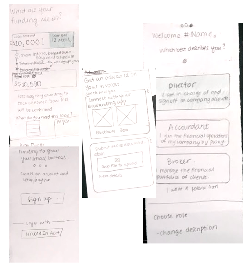
Sketching interfaces / Keeping in mind 46% of our users entered the site on their phones, I took a mobile-first approach. This stage allowed me to validate ideas and concepts quickly.
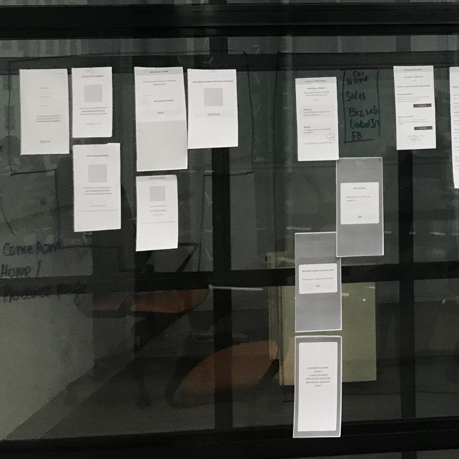
User testing / I used low-fidelity paper and digital prototypes for user testing, which allowed me to make several low-cost iterations.
Low-to-mid fidelity / Bringing the design to mid-fidelity was important for this project because we were building the design system at the same time. The focus was therefore on consistency and fewer overall components.
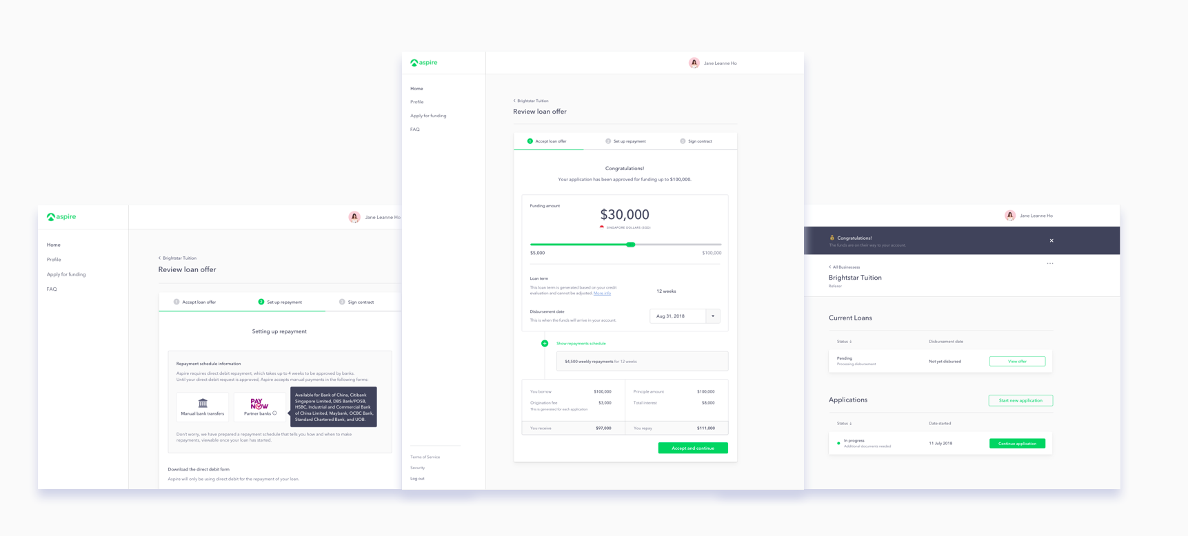
detailed Design Solutions
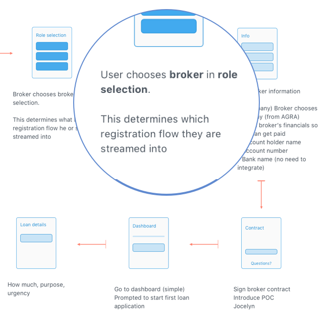
Creating a unified on-boarding process across different user groups
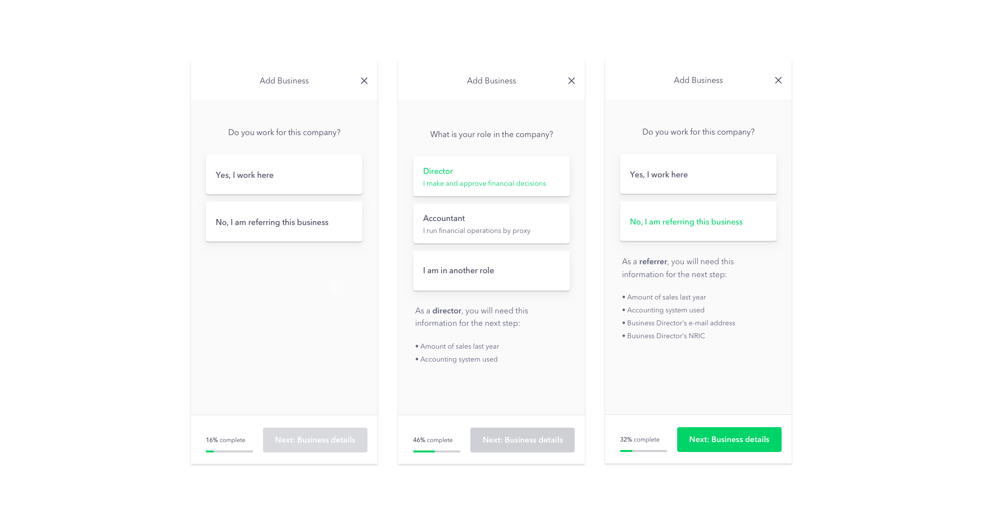
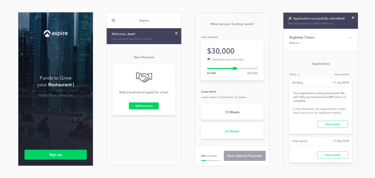
I modified the signup process to separate two user groups: directors/employees and external brokers, which we called “Referrers”. This step neatly segments the on-boarding process, allowing us to provide more guidance for each group in terms of documentation needed, information provided and support required.
Increasing usability across platforms
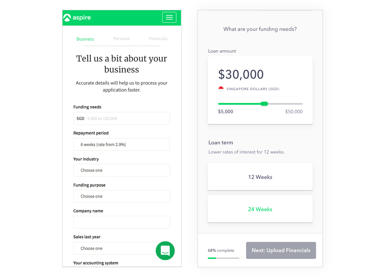
Before (left) and after (right) the redesign.
Screens from the mobile platform. I focused on creating tap-friendly components, making the copy easy to read, making UI elements consistent with the web platform and minimized the need for typing. Overall, I wanted to chunk the process into easy-to-complete parts, with the user always knowing where she is.
Screens from the desktop platform. With more space to work with, I was able to use white space to group components conceptually.
Building a smooth, guided repayment process
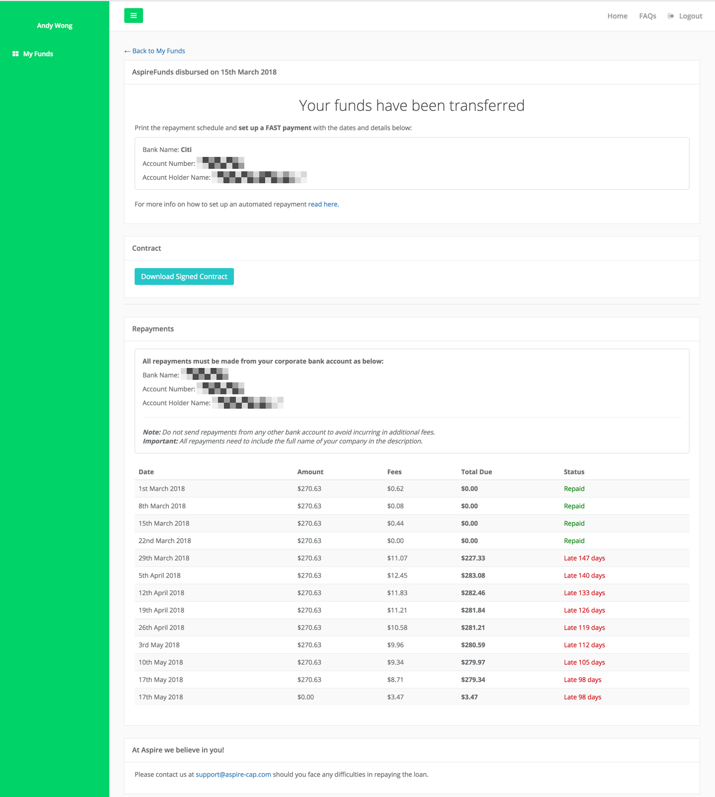
Original Loan Summary Page
Before the redesign (left)
This loan summary page is accessed from the dashboard, and shows the status and information around an existing active loan.
Overall, the order of information presented on this page is not the order of actual importance to the user. Usability tests showed the repayments schedule table is difficult for users to understand. Users also find it challenging to find more information about accepted repayment methods
Aspire also introduced a new feature, direct debit banking repayments, which needed to be explained on the page.
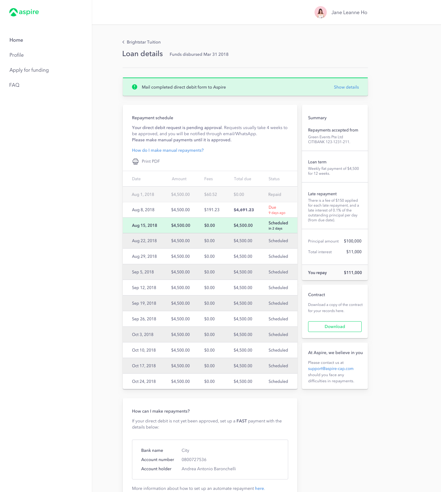
Guided Repayment Process
The redesigned loan summary page (right) presents the information the customer needs to know, in the order of urgency and frequency of usage.
The repayments schedule table is easier to understand, and users are able to print it out for their convenience.
Direct debit payments are also introduced in a clear, actionable way.
An announcement bar shows urgent information and is visually distinct from the rest of the page. A second column is introduced for important, but not urgent information.
Launch
The redesigned platform launched in early September 2018. It supports Aspire and our customers through over 2.5M in loans disbursed, in US dollars.
Feedback Collection Plan
I worked together with a backend engineer to segment our users by their completion of key segments in the funding process, in order to automate usability feedback collection. I used Survicate to create survey logics, Intercom, Mailchimp and Mailgun for in-app and email survey distribution, syncing the data with a Periscope dashboard for easy access. For in-depth exploration of particular issues, I created an internal workflow involving optics-tracking on FullStory. Besides providing critical feedback for the product team, this data is also used by Customer Success to fine-tune processes.